Perfect Pairings
With January in the rearview and February finally here, let’s have a look at some perfect style pairings that can elevate a space and cultivate a clean, coherent feel. Whether it be mixing patterns, complimentary colours, or texture combinations, each offers its own style or flourish.

Let’s talk colours: Classic combos such as blue and white or green and sage never fail to pair beautifully, but some more trendy pairings have also shown their value. Rich royal blue has shown to pair beautifully with a pale, creamy yellow to add an image of professionalism and coherency, perfect for an office or workspace. Rich red with baby pink is a fun yet subdued combination perfect for a bedroom or, if done well, even a bathroom. For those who are truly bold, neon green and fuchsia are a funky, vibrant pairing that makes each other pop and is perfect for those who are more fashion-forward.

Pattern mixing on the other hand is more risky but has quite the pay-off when done well, giving the appearance of a true style master. Pattern pairings are perfect for sheets and pillows, throw blankets and pillows, rugs, and more. A key aspect of pattern mixing is sizes and contrast: When pairing two patterns, make sure each is distinct and of different sizes and intricacy. Colours should also complement not clash, so try mixing dark more intricate patterns with lighter, simpler ones. If one is particularly busy, make sure to pair it with a simpler, complementary one.

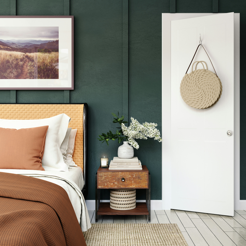
Ask for textures, a variety of combinations can add depth and dimension. Metals pair well with wood, matte and glazed add a level of class, and stone and macrame balance each other out. When looking at texture, don’t be afraid to layer and build, keeping an eye on all elements from base to lighting. That said, watch out and don’t get too busy; Too many textures and elements can overstimulate and make a space appear messy and disorganized. Even so, don’t be afraid to play around!
